Logo Redesign Case Study
The Original Logo

Rough Sketches
My logo started with a series of rough sketches, but at the time I already knew what I wanted immediately in my head. I drew out my original idea for my logo first, and then I sketched out a few more ideas. I usually like to do various versions of a design because sometimes a better idea will come along. However, in this case my original idea was the best of the sketches. Next I made a mock up of my sketch in Adobe Photoshop before designing it in Illustrator to what it would look like.

Variations
Once I created my mock up in Photoshop I designed my logo in Illustrator before deciding on the final logo. I designed several variations like I had did before with my sketches. I like to brainstorm and do many different variations on a theme because I may find something interesting that I hadn’t originally thought of designing and this did lead to a change in my logo’s design. Through these variations of my design I ended up dropping the background circle in my logo.
The First Version
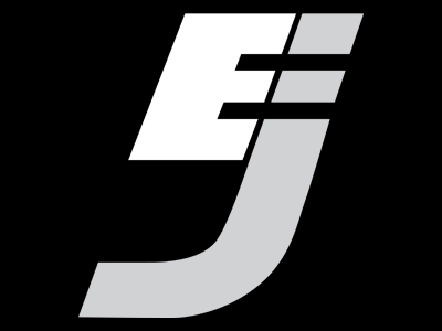
After designing many versions, I decided on my final logo design. My final logo design represents me in a number of different ways. I chose the font Han Solo for my logo because it represents the movie Star Wars and I am a huge fan of the Star Wars movies, and universe. I also chose to italicize my font for my logo to give the sense of forward motion because by going to school and choosing a new career, I am moving forward in a new direction in my life. I also chose to make the logo simple, so it is clean and memorable. I can move the scale up and down and the logo is still recognizable and I can use it as a favicon in a URL.
The New Logo

New Mock Ups
I decided to redesign my logo because during a presentation in my fifth quarter of my Bachelors degree it was brought to my attention that, even though it was well designed logo, that it looked like a five when displayed in my navigation bar. So when the logo was shrunk down to a small size such as being displayed in my nav bar it was not as recognizable, so to combat this I did a redesign. As before I did a series of mock ups in Photoshop. Once I completed my mock ups I narrowed down my choices and also asked a few of my classmates their opinion on which design they thought was best. Mostly every body agreed including myself that the eleventh one was the best, so that the one I went with.
The Logo
To make the logo more recognizable, I went about keeping the same shape of the logo, but breaking up the “E” and the “J” in various ways in my mock ups. At first I had just separated the “E” and “J” but I thought that there need to be more contrast in the design so it would even stick out further, so I added some color to the “J” and that really made a difference. Then I tested logo by putting in my navigation bar and it stood out much better. In the end I was pleased with the new logo and I think that it is improved version from the original.
Other Case Studies


