Business Card Case Study
Business Card Case Study Video
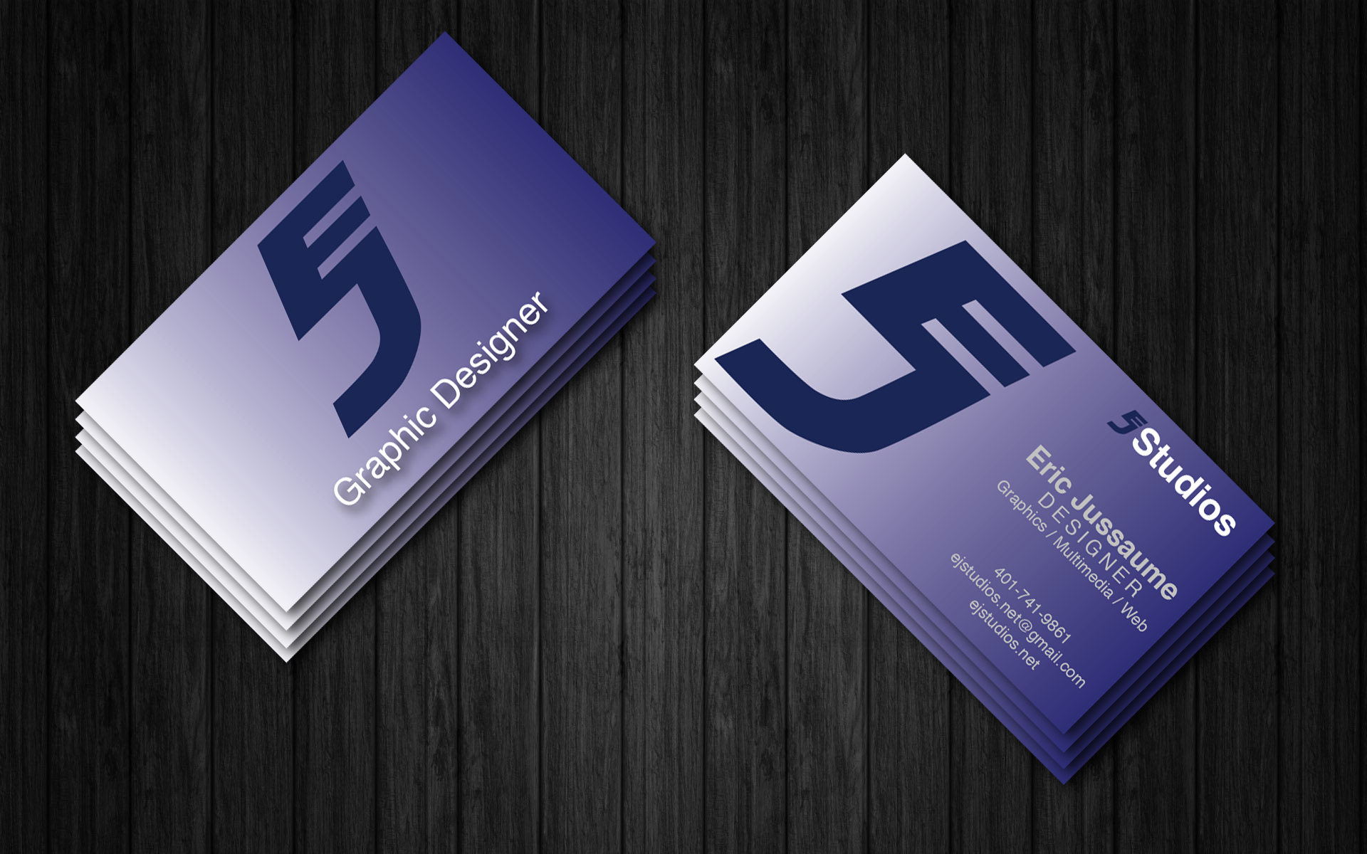
The Original Design
This is the final version of my business card both front and back. The design for my business card also came quickly to me like my logo. I chose to go with navy blue and silver for the colors because these are my favorite colors, and they represent me. I chose to use a gradient for the background color because, like my logo, it gives the sense of motion and gives the card the flow, drawing the viewer’s eye to the information on the right. I also chose to use the gradient because the white would contrast with the navy blue logo, making it stand out.
The card went through a couple of small changes through the design process. First, I designed one version in QuarkXPress and then later another version in Adobe InDesign. EJStudios was scaled down slightly. Graphic Designer was changed to Designer and the information at the bottom was changed three times over the course of the design before being I sent it out to be printed. The font used in the word Designer was changed from Helvetica to Gill Sans, and I increased the tracking to change the overall appearance. I used Helvetica and Gill Sans through the design of the business card because they are simple and clean fonts that are very legible. The business card had to mirror my brand like the logo and letterhead. I designed my website, Facebook, and Twitter page to have the same brand Identity.

The New and Improved Business Card
The new business card’s design didn’t come to me as quickly as the original card’s did. The new card’s design went through several iterations, as you can see in the video, before the final design came to me. However, I did manage to do what I set out to accomplish and that was to create a new business card that went along with my portfolio’s design and to also improve upon the original card’s design. I thought I did that and I am really happy with design of the card. It is sleek, minimalistic, elegant, and stylish. The spot UV on the card really draws the eye and the feel of the silk card with spot UV gives the card a really nice texture and feel.
Other Case Studies