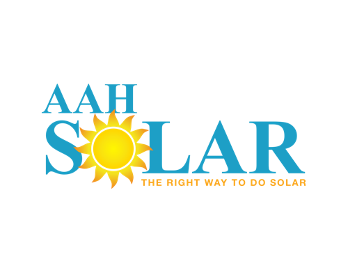
AAH Solar Logo Redesign
When I started to redesign the AAH Solar website I told the owner that I would like to redesign the logo as well, but he really liked the current logo. He said I could go a head and design some new logos and if liked any he would choose one from of them. So I went and designed several new logos for AAH Solar and then showed him what I came up with and he still liked the original. I couldn’t talk him into changing even though I had designed logos for two other parts of his company Acushnet Alternative Heating and Pellet Parts Online.
Well I didn’t let detour me, the logo was an I sore to and over time I made adjustments to it so it would at least look better. First I changed the tag line font to Helvetica Neau and tucked it underneath the the word solar. I also went into Adobe Illustrator and did a image trace on the sun to make it vector so it would look better, since the original looked like some had gone into Photoshop and knocked out the background and left edges around the rough and jagged.
Next, I removed the drop shadow on the logo since that wasn’t a current design trend and that was one of things that bothered me most about the logo. Then I next changed the font from Korrina to Times New Roman for the abbreviation and the word solar to give the logo a little more weight because that was my second biggest issue with logo.
Last, I changed the sun in the logo. It just never really fit with the logo. I was fine with it there replacing the “O” in the word solar, but I thought a flat sun would be perfect and a clean minimalistic look. I ended designing a few versions that were with solid colors and with the gradient. In the end I decided on keeping the gradient because it gave the sun a look like it was glowing and drew the user’s eye towards it.
More Case Studies