Olympus Camera Rebranding
For the Olympus camera rebrand we were given the assignment to find a brand that had fallen on hard times and could use some UIUX improvements along with its rebranding. This was different from just a package redesign like the cereal box I chose, which you can see further down on this page. This was a total rebrand, to improve the UIUX and choose a target audience to gear my redesign to. I chose Olympus because I thought that they were one of the better camera brands on the market and used to have a larger market share, but in recent years they have lost market share to companies like Sony, Samsung and Panasonic. Also, since loosing market shares to the other companies they have really fallen behind the big two camera companies Nikon and Canon. Another problem for them and other camera companies was that a lot people now use their phones and tablets to take pictures, so this was another problem that had to be addressed.
Old Packaging and Logo

Rebrand
Target Audience
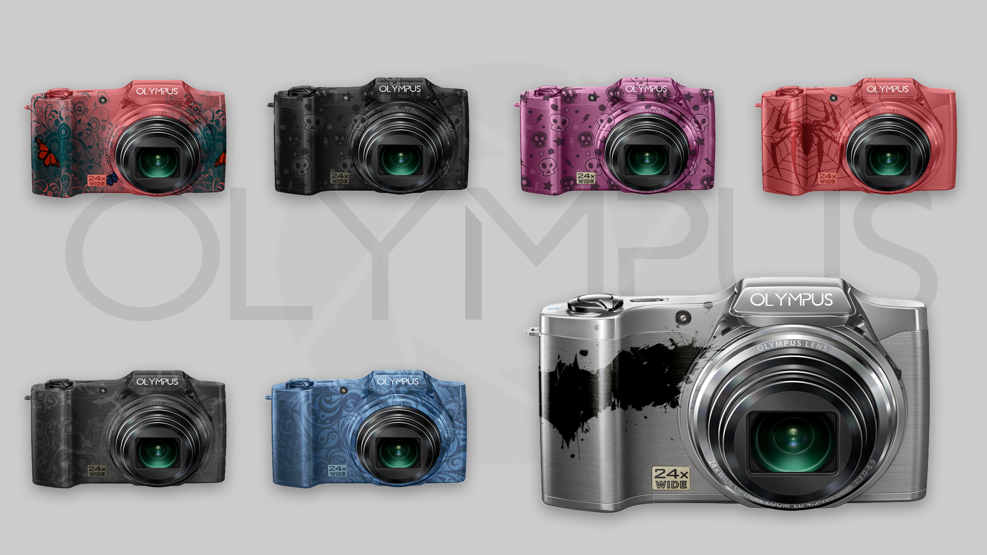
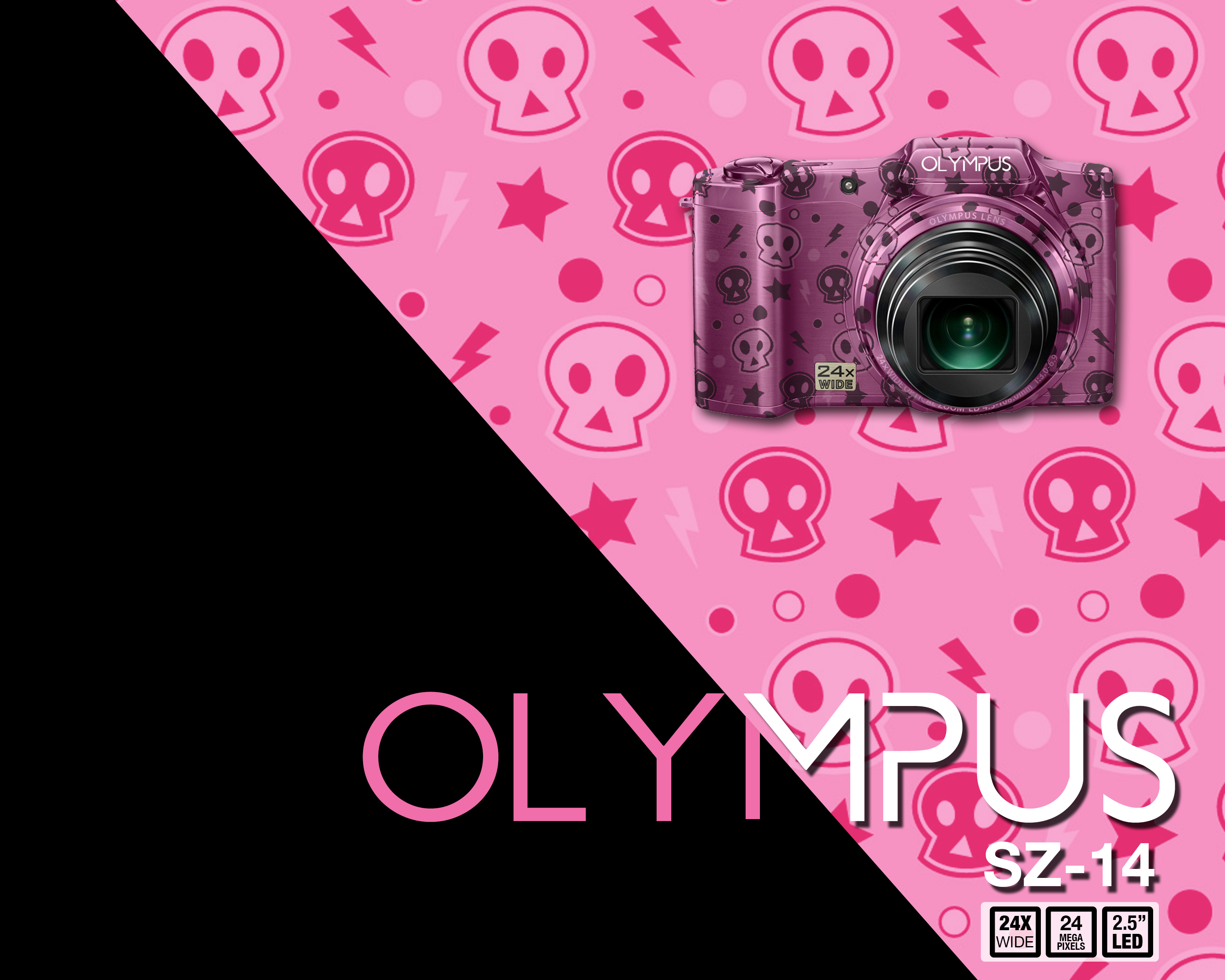
I chose to design my rebrand for two target demographics: kids to teenagers, plus young adults to early forties. I thought these groups were the most likely to purchase a camera and I think I have a good strategy to market my rebranding of Olympus to this target. Rebranding to these demographics required examining the look and feel of the brand and packaging. I thought it was bland and looked dated. In comparison with Nikon’s packaging which is much better and attracts the viewers eye. I thought the color scheme needed to be changed from the blue and gold to black, white and silver, which presents them as sleek, elegant, and sophisticated. This color rebranding will attract both age groups, but mainly the young adult to forties group. For the younger demographic I though that a use of graphics on the cameras themselves and packaging would attract younger consumers. Also, the use of color schemes geared to teenagers and boys and girls would help to attract more potential customers.


Logo Redesign
One of things that I thought that could use an upgrade was the Olympus logo. In looking at all of the camera brands logos you immediately notice that they use typography for their logos and don’t use symbols, because they want the brand name to stick out on their product due to a lot of their products being small in size. I thought that the logo needed to be paired with a color scheme by being sleek, sophisticated and elegant. I also wanted to look futuristic, bringing the company into the the now. I thought that these improvements would really attract the consumer. I first found a font I liked, then made some slight modifications to it and I think that it is an improvement to their logo because the current logo is dated to the seventies and eighties.
The App and Gamefication
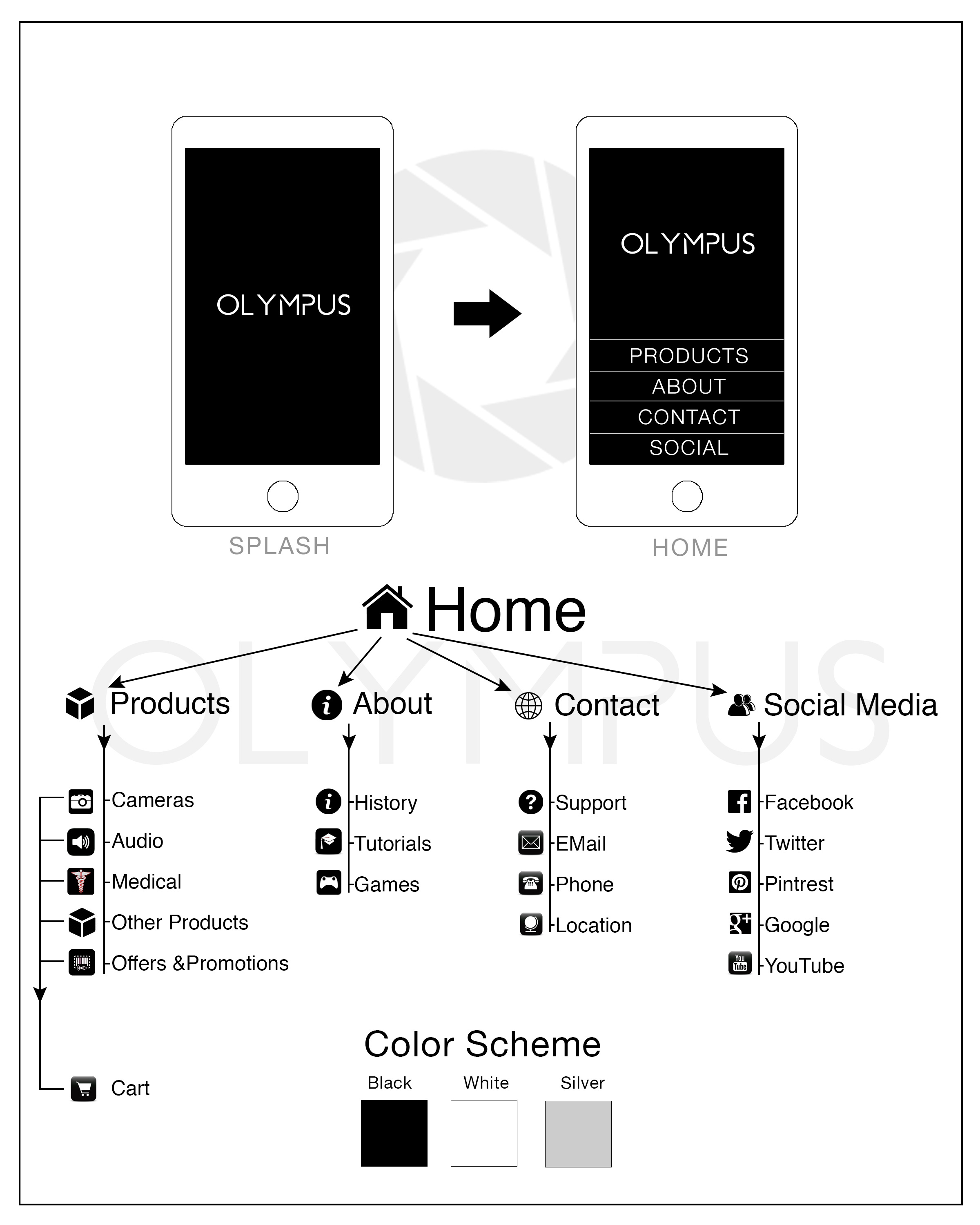
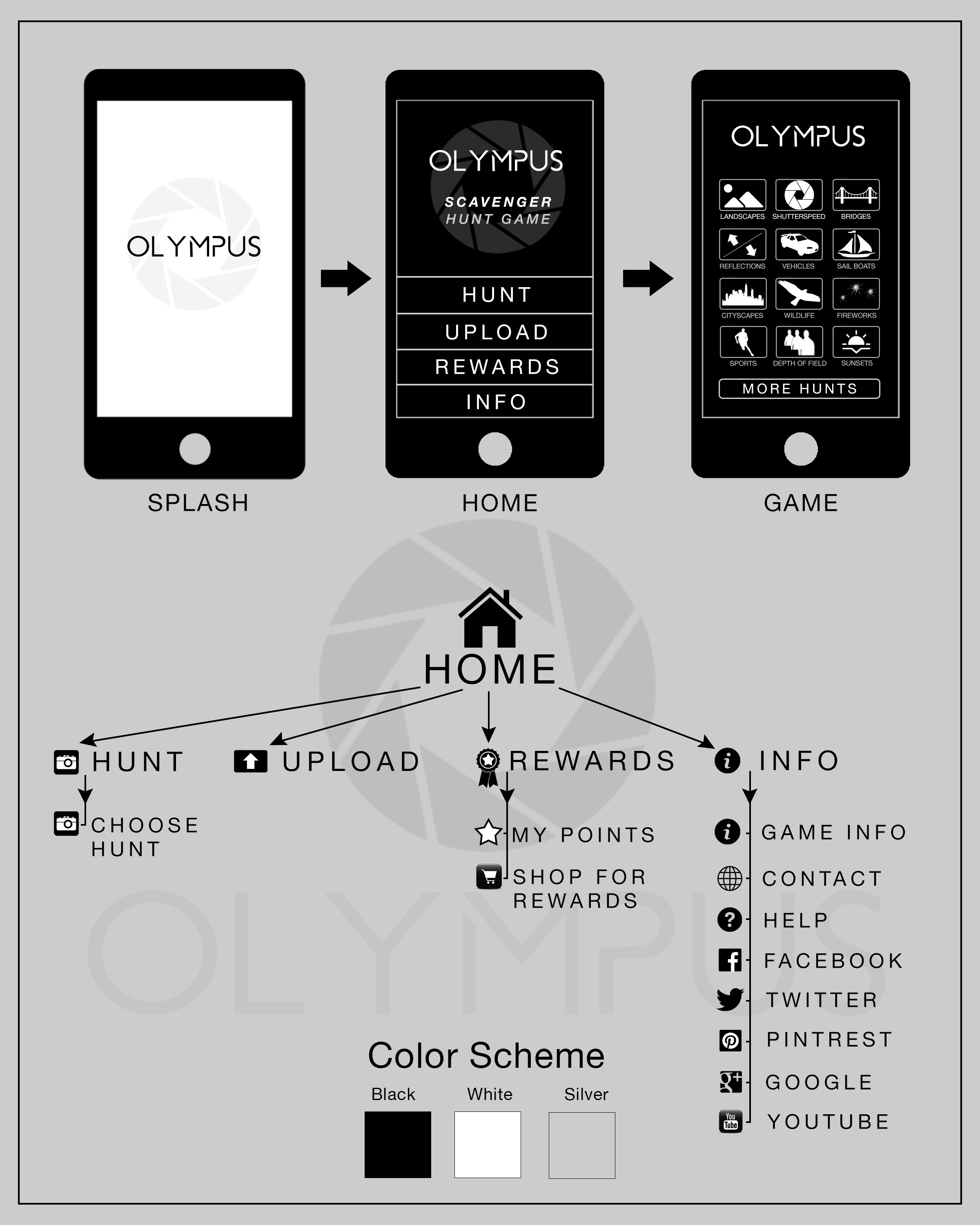
Another part of the Assignment was to come up with brand mobile app and a game for the brand to get more people involved with brand. For the mobile app I wanted it to look sleek and sophisticated and I wanted the branding to be crossed branded throughout the brand and used the same color scheme of black, white and silver. I also want the app to be user friendly by having the buttons be large on the home page and a limited amount of options to get to the point for the user. As you can see in the flow chart above the user can click on one of the buttons and would then take them to more options and one of those options would lead them to games.
Type of Game – Scavenger Hunt game that would be part of the mobile interface in their about section and on their website so they can also upload pictures that way. Additionally the users could upload pictures through their Olympus brand blue tooth cameras to their phones, tablets and computers, and through separate mobile scavenger hunt game app so, to have multiple ways for them participant and to their upload photos.
Objective – the game’s objective would be to select a scavenger hunt subject such as, take a interesting picture of bridge, or take a shutter speed shot of water, or take an a interesting picture of reflections and then submit the photo to earn points and later cash them in to earn prizes. Take more photos with Olympus gear to earn more points at certain locations. Another objective would also be to take pictures with Olympus brand gear at certain location to earn extra points. The Overall objective of the scavenger hunt game is to get more people involved and interested with the Olympus brand and to get them to start purchasing their products over other camera brands. The app will keep the user interested in the Olympus brand, photography, and in the game to keep them on coming back and taking more photo to earn points and earn more prizes.
Rewards – for the game would be Olympus cameras, camera bags, lenses, tripods, Olympus hats, T-Shirts and other camera gear or have your photo featured on their website. It would depend on the particular scavenger hunt for what the prizes would be set at.
Web Design

Home Page
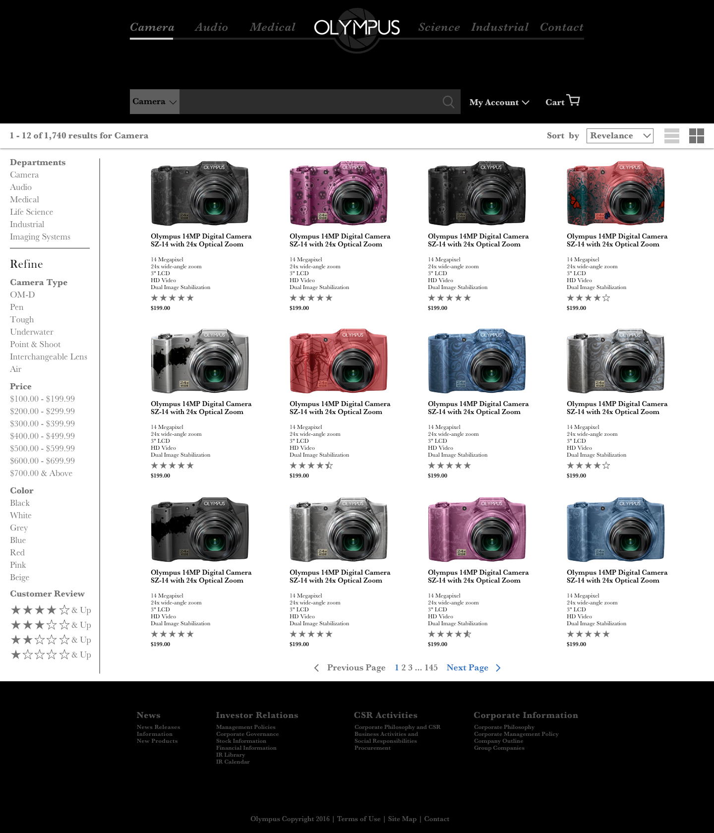
Shop Page

Product Page

Contact Page
Website Redesign
Taking the project to the next level with a redesign of the Olympus website. This part of the project took place after the I had completed the project. I wanted to go back and do more UIUX design by redesigning the website. I thought this redesign of the website would really finish off the project in a great way. I had originally wanted to do this part of the project at the time of the project but didn’t have the time to do so at the time, so I came back after to do so. This part of the project was probably the most time consuming, but when I designed it I had more free time and I was really able to focus on it.
More UIUX
Click on the images below