Cereal Packaging Redesign
Cereal Packaging Redesign
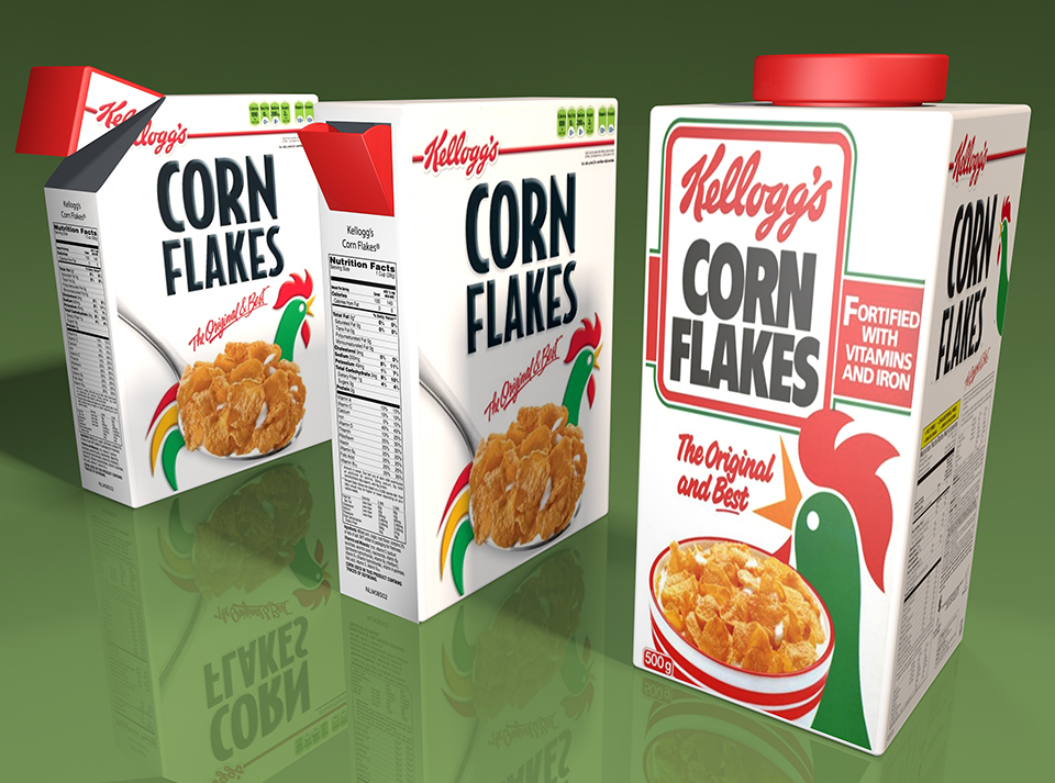
The classic cereal box has’t changed much in the past 50 years, so it is a successful package design but it can be improved upon. The primary users for this product are anyone who eats breakfast cereal. The problem with the UI is that it has limitations because sometimes when opening the cereal box it rips. Also, even more annoying is opening the bag within the the box which usually never opens correctly, which leads to the cereal becoming stale more quickly especially when most consumers usually have more than one cereal box open at a time . Another limitation with the design of the cereal package is even if both packages that contain the cereal open correctly, the cereal will become stale over time due to most cereal bags not being resealable. So after interviewing a few people about this, they agreed and come away with the same UX that I have experienced.
The Redesign
First I thought that a carton worked, but then you run into the same problem with it ripping sometimes. So then I thought a cartoon with twist cap could work, but the opening would be rather small for the cereal to come out, even if you made it bigger than the liquid version (Milk, Orange Juice). Then my next thought was a plastic container much like a laundry detergent bottle and that would work pretty well but it is plastic, so I thought there could still be a better solution to avoid the recycling of the plastic which could harm the environment. Then it hit me: hot cereal like Quaker Oats uses a cylinder and this would be perfect. The cylinder is easy to open and close and it keeps the cereal fresh, but I thought that the Quaker Oats cylinder still had its limitation due to its cap. Since a lot of children handle cereal boxes I thought a twist off cap would work much better in case of drops. The current Quaker Oats container has a lid that just pops off and if the container is dropped it could easily spill. So I think this redesign will definitely benefit all the stakeholders by saving them money because they will have to buy less cereal due it staying fresh longer and it won’t waste as much resource as well.


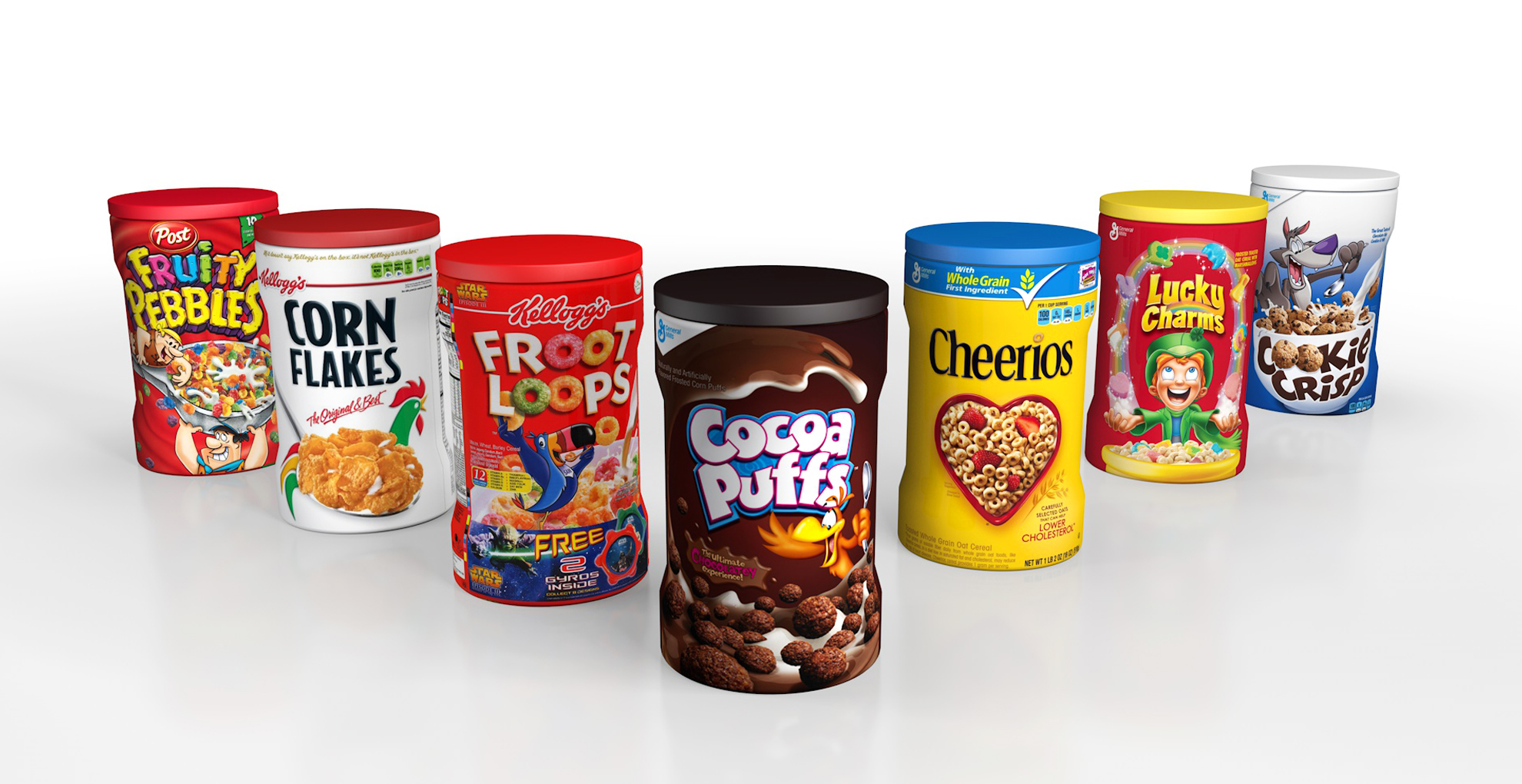
Versions
As you can see for the images above the process for the cereal design went through a few different iterations. Even though I had come up with the cylinder design in my original sketch I had suggestions from other classmates to try as we went over this redesign UIUX process over a three week span. I eventually settled on my cylinder shape as the best solution to my UIUX problem. I made the cylinder ergonomic making the cylinder gradually thinner in the middle. I thought since a lot of cereal is consumed by children that this made a lot of sense due to them having smaller hands and this would negate the chances for less frequent drops. The large opening at the top was ideal and would make the cereal easy to pour out and the twist off top would keep the cereal fresh, as well as spill proof. Another great thing about the redesign is that it would take up less space on the shelves in stores and allow companies to display more products. Since cereal boxes always have extra space in the box and in the bag the redesign would save space on the shelves as well as save material on packaging, saving the companies who made the packaging money. This would also save save space for the consumers in their homes as well. I thought the cylinder could be made out of the same materials (cardboard and plastic) that oatmeal containers are currently made of. Additionally, the container could serve other functions as well, once the container was emptied of cereal. It could hold other food or pencils and pens or be used as a shipping package.
More UIUX
Click on the Images below